Mastering Data Visualization: An In-Depth Introduction to Advanced Excel Charts
Introduction:
In the dynamic world of data analysis, the ability to present information in a clear and insightful manner is crucial. Excel, a versatile spreadsheet software, goes beyond basic data entry and manipulation to offer powerful tools for data visualization. In this comprehensive article, we will delve into the realm of Advanced Excel Charts, exploring the diverse array of features that empower users to create visually stunning and meaningful representations of their data.
I. The Evolution of Excel Charts:
Excel, initially conceived as a tool for basic calculations, has evolved into a powerhouse for data analysis and presentation. Over the years, Microsoft has consistently enhanced Excel’s charting capabilities, introducing advanced features that cater to the growing needs of analysts, business professionals, and data enthusiasts.
II. Understanding the Basics:
Before we embark on the journey of advanced Excel charts, it’s essential to revisit the basics. Excel offers a variety of standard charts such as bar charts, line charts, and pie charts. These foundational charts serve as the building blocks for more complex visualizations.
III. Sparklines – Micro Charts for Macro Impact:
One of Excel’s hidden gems is the Sparkline feature. Sparklines are miniature charts embedded in a single cell, providing a quick visual summary of trends within a dataset. We will explore the intricacies of creating sparklines and leveraging their power to convey valuable insights at a glance.
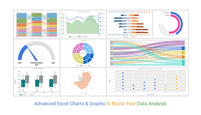
IV. Advanced Chart Types:
Excel boasts an impressive array of advanced chart types that go beyond the conventional options. From radar charts to bubble charts, we will delve into the unique characteristics and use cases of each, empowering users to choose the most effective visualization for their specific data.
V. Dual-Axis Charts and Combination Charts:
To enhance the depth of analysis, Excel allows users to create dual-axis charts and combination charts. We will explore the advantages of these features, demonstrating how they enable the simultaneous representation of multiple data series and facilitate a more comprehensive understanding of the underlying trends.
VI. 3D Charts – Adding Dimension to Data:
For those seeking to add a touch of sophistication to their visualizations, Excel’s 3D charts come into play. We will discuss the intricacies of creating 3D column charts, pie charts, and surface charts, highlighting when and how to effectively use these features without sacrificing clarity.
VII. Dynamic Charts with Data Validation:
Excel’s data validation feature allows users to create dynamic charts that automatically update based on user input. We will explore the steps to set up dynamic charts using data validation, ensuring that your visualizations remain relevant and up-to-date with minimal effort.
VIII. Advanced Formatting and Customization:
To truly make your charts stand out, mastering advanced formatting and customization is essential. We will cover techniques such as adjusting axis scales, adding trendlines, and incorporating data labels, empowering users to tailor their visualizations to meet specific analytical objectives.
IX. Real-World Applications:
To solidify the concepts discussed, we will delve into real-world applications of advanced Excel charts across various industries. From financial analysis to marketing campaigns, we will showcase how these visualizations can be employed to extract meaningful insights and drive informed decision-making.
X. Tips and Tricks for Optimal Chart Creation:
To conclude our exploration of advanced Excel charts, we will share valuable tips and tricks to streamline the chart creation process. From keyboard shortcuts to hidden features, these insights will enhance your efficiency and proficiency in leveraging Excel for data visualization.
Conclusion:
As we wrap up this in-depth introduction to advanced Excel charts, it’s evident that Excel is not merely a spreadsheet program but a powerful tool for visual storytelling. By mastering the diverse features and techniques covered in this article, users can elevate their data analysis skills, unlock deeper insights, and communicate complex information with clarity and impact. The world of advanced Excel charts awaits – embark on this journey and transform your data into compelling narratives.